Descubrir Patagonia
Local rent a car


Travel. Discover. Enjoy
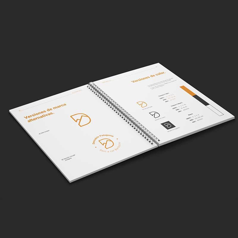
This family business reached out to me to make its brand identity. They wanted to establish themselves as a trustworthy and quality rental company attended by their owners. An analysis of its competence was done, and the concepts for the brand were established. After a month and a half of work, the result was a clean, high-contrast identity. The symbol, in a linear style, resulted from a combination of the brand's initial and mountains, characterizing the landscapes of Bariloche, the city where this business is based.

Brand guidelines
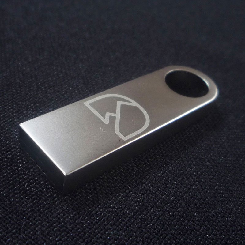
Once all aesthetic and conceptual guidelines were established, they were compiled into a brand guidelines to ensure consistency in corporate identity. The client was provided with a hardcover, spiral-bound book, alongside a box that included a USB drive engraved with the logo, containing all the digital files.
- Logo design
- Branding (concepts, color palette, typefaces, photo usage, etc.)
- Brand Guidelines